Vietnam Compass is a turnkey business advisory service for investors looking to benefit from favorable labor costs or exporting Vietnamese products. Vietnam Compass wants to build an image of not only a reliable assistant but also a loyal fellow-passenger for all oversea businesses that want to co-operate or set up a new business in Vietnam.

As Vietnam Compass want to present itself in the most professional and reliable image from the beginning, the company is looking for a strong and efficient brand identity. This project aims to develop a branding system, which:
- Creates an image of a strong and professional business
- Brings specific images of Vietnam which can be easily recognized
- Suggests the reliability, responsibility, efficiency and high quality services
The concept for Vietnam Compass’s branding is: “Vietnam – The Promising Land”.
As the company is developed to be a business advisor service for investors who want to invest or set up new businesses in Vietnam, Vietnam Compass targets to build a new image of Vietnam in the eyes of their potential clients or partners. It cannot be denied that there are a number of foreigners who still think that Vietnam is a poor country after suffering from the wars. Understand that problem, Vietnam Compass, besides keeping the specific features representing the traditional Vietnam, wants to bring out an image of a developing country with plentiful natural resources and growth potential, which can be a ideal place for investment and doing business. For that reason, the branding of Vietnam Compass was developed based on the concept: “Vietnam – The Promising Land”. The concept focuses on two main things: highlight the image of Vietnam and indicates the characteristics of a The Promising Land.
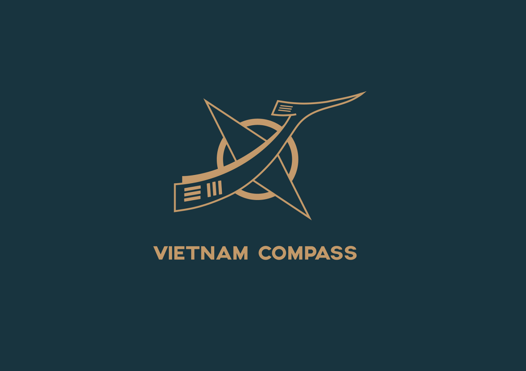
The symbol of the Vietnam Compass’s logo, in order to bring out the characteristics of the business represented by the company’s name, as well as highlighting the image of Vietnam, was developed based on the image of a compass and the Viet Bird (which is called “Chim Lac” in Vietnamese).

The Compass, which exists in the name of the company, represents for the oriented characteristic of the business, as the company was built to be a business advisor and consultant for their clients. In the logo’s symbol, the compass, which was modified to be the wings of the Viet Bird and to indicate a movement, looks more oriented and dynamic.
On the other hand, Viet Bird is one of the ancient symbols of Vietnam, which symbolize the spirit and traditional culture of Vietnam. Being found on the surface of Vietnam’s ancient “Bronze Drum”, the symbol contained the positive aspirations for flying, for the prosperity and development. Viet Bird, in its original version is pretty detailed and artistic; however, in order to meet the characteristic of selling hard business of the company, the logomark was altered to be more simple, strong and solid.
In addition, the outline of the symbol is a circle set in thick stroke. In terms of meaning, a circle represents the unity, the wholeness and infinity. It is also the symbol of protection and perfection.
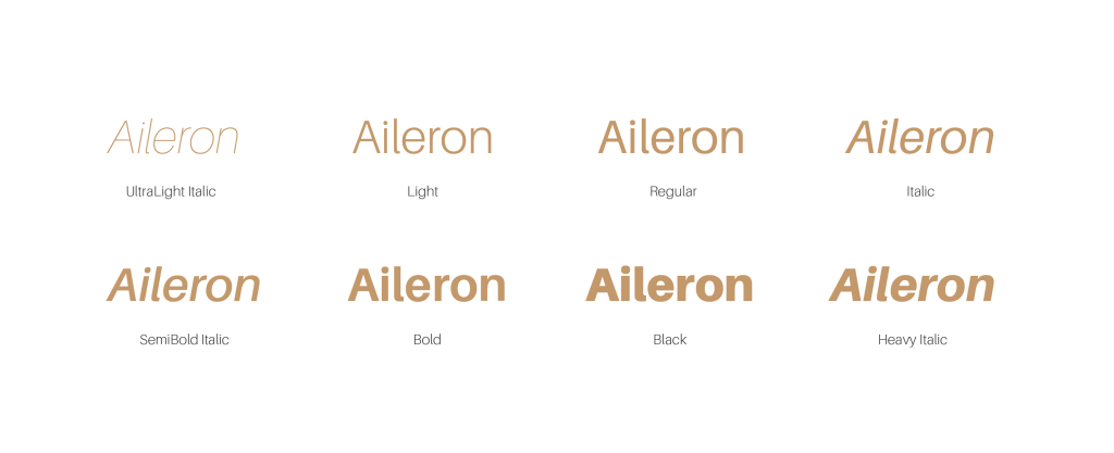
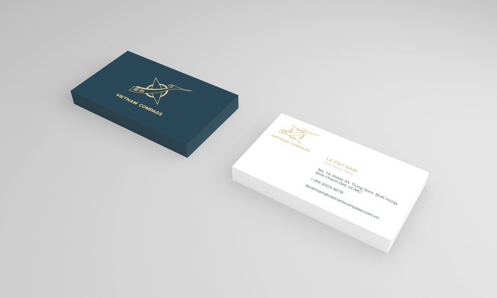
In terms of typefaces, Axis was chosen to be the typeface for the signature of the logo. It is a san-serif typeface, which was inspired by the geometric of the urban environment. The space between two letters makes the typeface strong and impressive, while it is still readable and legible. In uppercase, the typeface looks formal and stable. On the other hand, the main typeface for the brand is Aileron. While Axis is used for logo, Aileron appears in all other parts, such as the tag line, addresses, and other contents. Aileron is a comfortable visual typeface, which is legible and readable. This typeface creates a clean and formal look. It is also flexible with 8 weights, hence supports variety media usage.

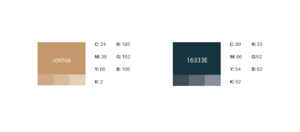
The color scheme for the branding is the combination of the deep teal color and the gold color. Deep teal is the color of clarity, idealism. As the color is the combination of blue and green, it has both the reliable and loyal characteristics of blue and the balanced and stable characteristic of green. On the other hand, gold was chosen to create the contrast with deep teal. Gold is the color of success, achievement and triumph. It also denotes wealth and prestige in every country and culture. Furthermore, gold color can easily draws attention for visual impact.


CREDIT:
Designers: Keo, AJ Nguyen, Rao Vu, Thong Pham
