
Samasa is an old-time often-seen matchbox brand with an iconic dragon illustration. The images on Vietnamese matchbox covers before 1975 varied from the traditional – drawings of zodiac animals, to the modern – brand advertising and popular singers of the day. However, the brand had disappeared.
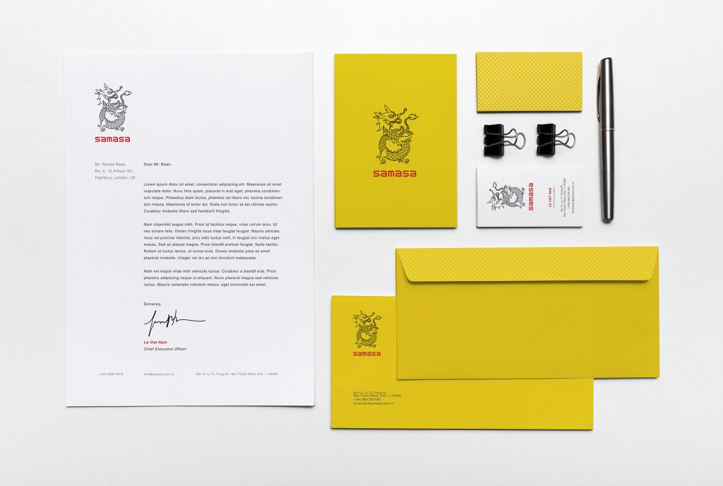
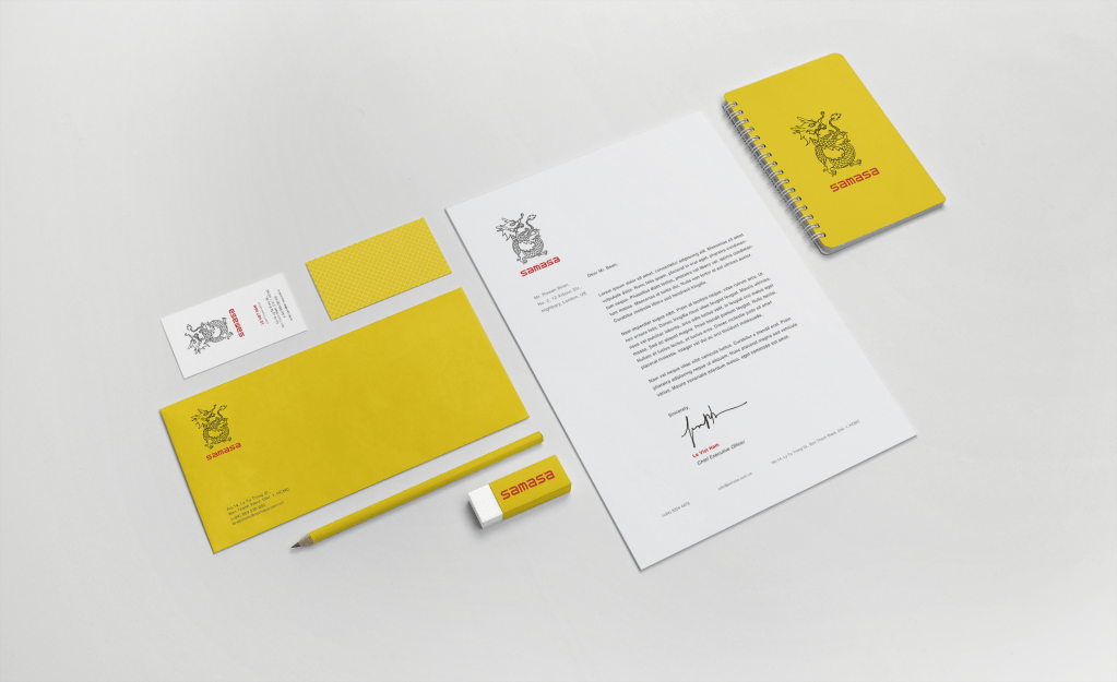
The aim of this project is to bring back Samasa, with new identity and package series, make it once again the coolest matches brand. The brand had an unique brand image with an iconic dragon symbol and customized signature. However, the brand logo seems to be no longer appropriate, and a re-branding process is suggested to help the brand keep pace with the modern world. It also aims to develop the brand in a new direction making the matchboxes become unique and symbolic objects, which are produced as special gifts or souvenirs instead of normal implements.
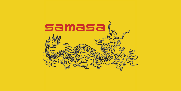
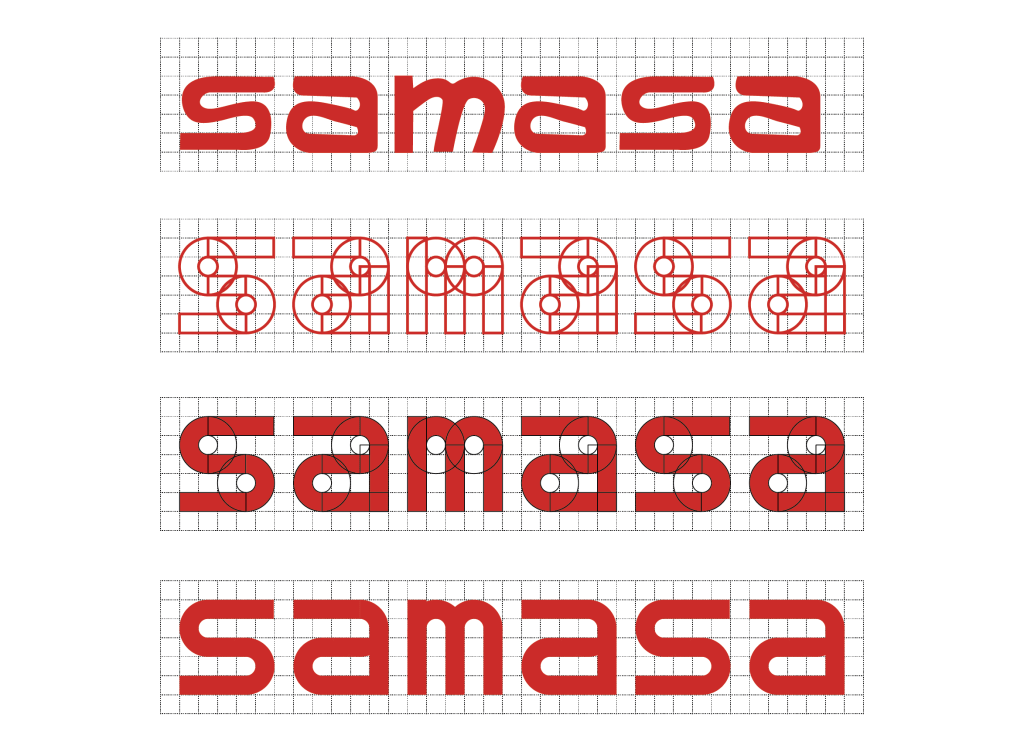
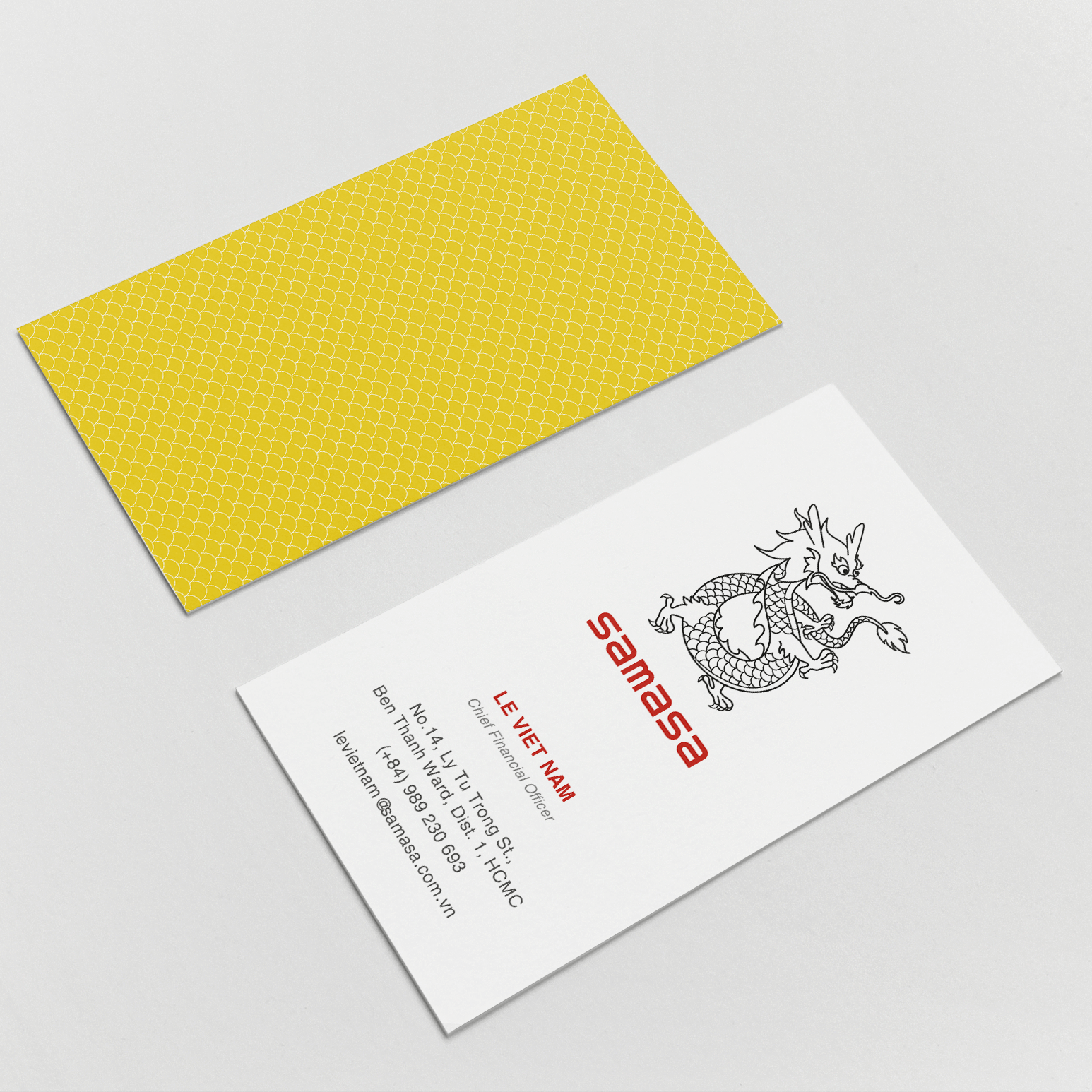
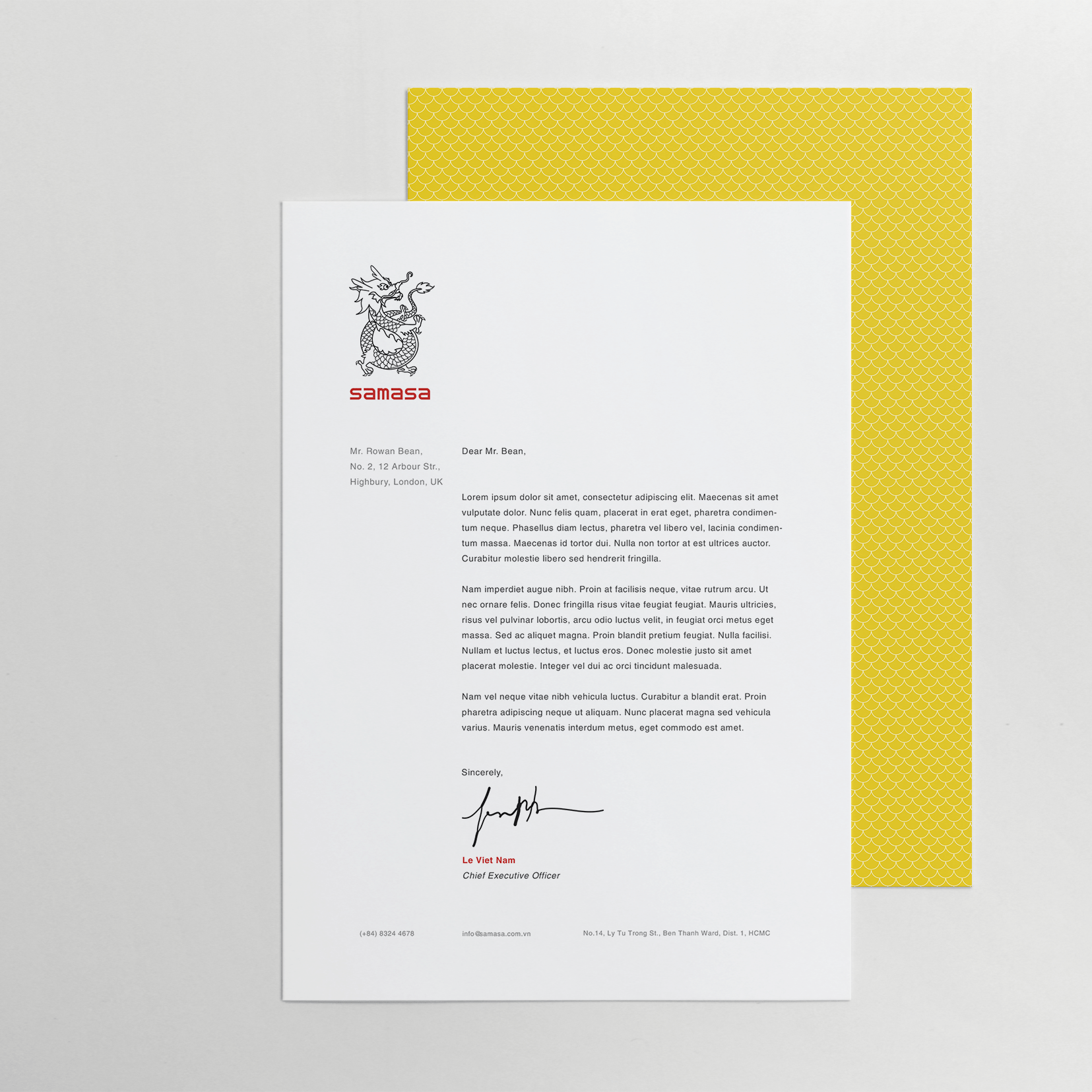
The new logo symbol tries to simply the dragon shape while still maintaining the Asian traits and unique characteristics of the dragon. The proportion and position of the dragon was also changed to make it look more strong and impressive. The re-designed signature of the logo is created by modifying the old signature. This make the logo look more clean, and modern, while still maintaining the unique traits of the old logo. It also ensures the legibility and readability.


The new designs try to maintain the specific and unique color scheme of Samasa, including Yellow, Red and Black. White is used in the dragon scale patterns to neutralize the high contrast created by the main colors.
Helvetica is the typeface used for all the text except the signature of the logo. This typeface is both legible and readable, and it creates a clean and formal look for the brand. As the typeface will be used for a Vietnamese brand, which target both Vietnamese customers and international customers, it was customized to create the ‘extra’ Vietnamese diacritical marks. This customized typeface can also be use flexibly with 4 basic font weights: Regular, Italic, Bold and Bold Italic.


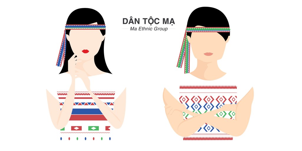
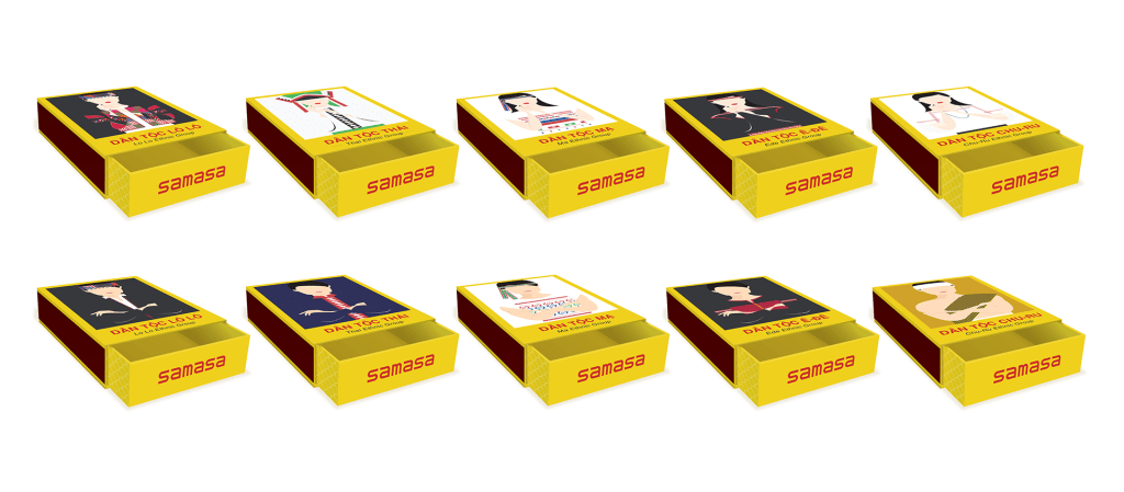
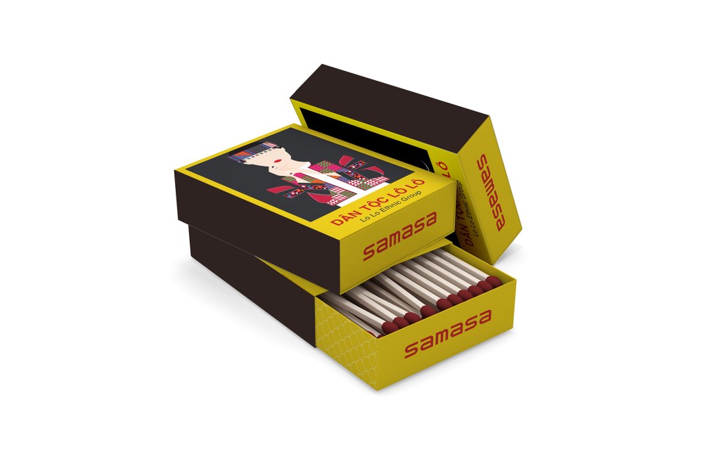
The old designs for the match boxes were often drawings of zodiac animals, or brand advertising and popular singers of the day. However, the new designs target to the new direction. Both sides of each matchbox are used to promote the beauty of Vietnam through illustrations. This will makes the matchboxes become an interesting objects to collect. They will also ideal souvenirs for every foreign people who are interested in Vietnam and Vietnamese culture. Hence, the match boxes can do more than its normal uses.
The first edition of the new matchbox designs is Vietnam Ethic Groups. On each match box, there will be images of one of 55 Vietnamese Ethnic Groups. An image of a male in an unique ethnic costume will be on one side, while an image of a female of the same ethnic group will be on the other side.


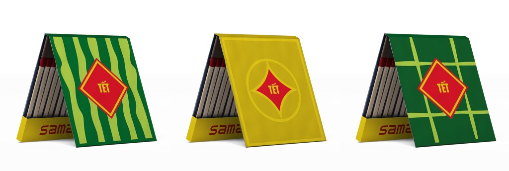
Beside, there will be a number of Limited Editions of match boxes on Vietnamese special occasions (such as Tet Holiday or Mid-Autumn Festival). The match boxes will also have special form that is different from the normal version. In each limited edition, there will be a number of match boxes designs that illustrate the specific traits and objects related to the occasion. For example, in Tet Holiday, the match box designs will be inspired by a watermelon, a gold coin (represents the lucky money) or a Chung cake (a Vietnamese traditional square rice cake).
CREDIT:
Concept & Design: Keo, AJ Nguyen, Windy Nguyen
